Choosing the best colours for PowerPoint isn’t as black and white as it seems. Many factors go into picking a powerful palette – involving everything from your audience’s emotions to your talk’s cultural context and, of course, to how your slides look.
Suppose you’re taking it as seriously as you should. In that case, you need to consider all of these when deciding on your colour scheme – as nailing this aspect of your presentation’s design will help you to communicate your message in the most impactful way possible. Interested? Let’s get stuck in.
Complementary colours

It would help to consider contrast when picking two or more colours for your presentation.
Contrasting colours are valuables when it comes to heightening the visual effect of your slides. They’re instantly impactful – reeling your viewers in by drawing their eyes to the screen. Also, they enhance your slides’ other elements – such as any fonts or tables used – increasing their visibility when used correctly. There’s a reason why black is nearly always paired with white and blue with yellow or orange. Together, they create a powerful impression… and it’s all thanks to contrast.
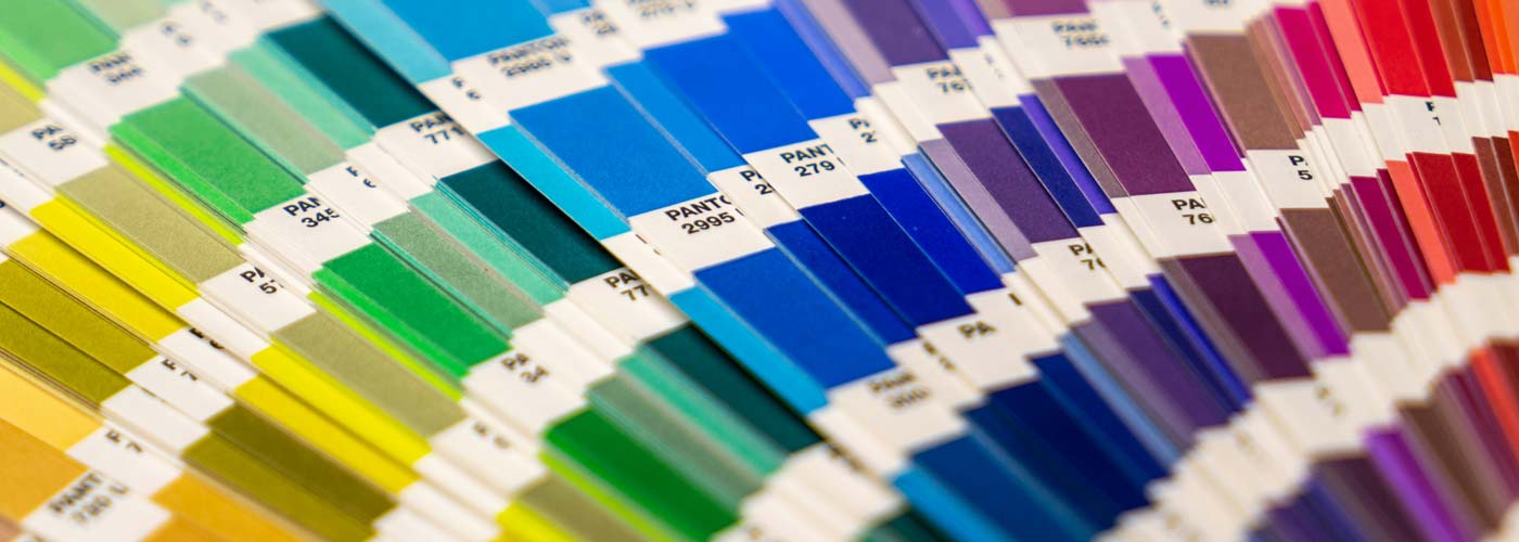
There’s a simple way to discover contrasting colours, and that’s by using a simple colour wheel. With this tool, you can easily see which colours are the opposite of which… helping you to refine your palette and ensure your presentation has colourful clout.
It also helps to follow the 60-30-10 colour rule. It’s generally for interior decorating but can support picking a colour scheme.
What Colours should not be used in PowerPoint?
When choosing colours for your slides, it’s important to create a contrast between the background and the text. I recommend avoiding using light text on a light background.
For example, a yellow background with white text often makes the text difficult to read. Likewise, with yellow text on a white background, it’s challenging to see.
Make sure your presentation content can be seen at the back of the room. You can use a colour contrast checker to ensure you have a strong contrast ratio to ensure your slides will be readable. This will help make your text more readable and provide a clear contrast between the text and background of your slides to enable your audience to follow along easily.
What are the Most Popular Colours for PowerPoint?
Here are some of the best colour combinations in PowerPoint. You can choose to experiment with your own as well.
Red & Black

Black & Yellow

Others include:
-
Blue & Yellow
-
Black & White
-
Orange and blue
-
Yellow and purple
-
Black and white
The selection method is slightly different for more complex presentations using three or more contrasting colours (triadic colours, for those who want to know). Pick three equally distanced colours around the colour wheel to choose the best complementary shades. These colours should, again, work beautifully together – providing that perfect contrast you crave.
Popular triadic choices include:
- Orange, green and purple
- Yellow, blue and red
Generally, we wouldn’t advise throwing a fourth colour into the mix – or more, besides. While using bright colours can have a wonderfully eye-catching effect on your PowerPoint slides, using too many at once could make them too “busy” – overloading the audience and detracting from the potential power of the colour combinations you’ve used. Adhere to the cliche “less is more”, and your simple yet striking presentation should speak for itself.
Colour psychology

You’re probably already familiar with the basic principles of colour psychology. Essentially, it’s been said that specific colours have set effects on people – specifically, causing them to feel a particular way. For instance, red is purported to inspire anger, blue to calm, and yellow to feel joy.
While there’s something to be said for this, colour psychology (as many people understand it) isn’t a flawless theory for one big reason: emotions aren’t quantifiable! Therefore, we can’t honestly claim that specific colours create the same feelings in every person – everybody’s different, and shades carry unique meanings for most of us.
You want to tap into your audience’s context of specific colours and other psychological and physical factors that may come into play. This is where the true magic of colour psychology lies. By understanding what influences your audience when it comes to colour – and knowing which colours are paired up with which emotions and responses in their lives – you can design something that sings. For instance, did you know that while, in Western and Japanese culture, the concept of love is associated with the colour red, it’s symbolised by the colour blue in African culture and yellow in Native American?
You can also your colour choice to the theme of your presentation. More on that later.
Know your audience. Get to know what inspires them, and let that influence your palette. It could make all the difference.
Colour symbolism

So, now you know to look into contrasting colours and your audience’s association with them. But we’re missing one major factor: you. What colours reflect you the best?
There are two ways that you can approach figuring this out. The first is straightforward: looking at your brand’s existing design. If you have a strong image already – of which colours will doubtlessly play a role, used on your website, logo and elsewhere – this is where you should start when designing your presentation. After all, these colours are already associated with you, so using them will create a strong link between your PowerPoint and the rest of your materials. Further, use colours so your audience can recognise you more quickly, and your presentation should look more professional. There are a lot of pros.
Option two requires a bit of decision-making. Suppose your brand doesn’t have any firm affiliations to colour already. In that case, you should consider which colours are associated with what in the context of your presentation and overarching brand ethos. Similarly to the colour psychology we’ve discussed, these hues will help you communicate your message clearly (and colourful).
Some colour combinations are considered classic. They go together
Some popular colour associations include:
- Green – nature, the environment
- Blue – the ocean, sadness (referred to as “the blues”!)
- Orange – warmth, autumn
- Red – anger, love, energy
So: what are you talking about? Are there any clear colour associations to that topic already? Drill down to the heart of your presentation’s message, and choose the colours that reflect that the most.
One final thing. Once you’ve discovered your “essential” colour – whether that’s the colour that’s most strongly associated with the topic of your presentation or the colour that you’re hoping will have the biggest influence on your audience – make sure to make it the strongest colour on your palette (for instance, the background of your slides). This should ensure it delivers the impact you’re hoping for… levelling up your talk. Perfection.
Over to Hue
We know that we’ve given you a lot to think about, but if you’re ever feeling confused over colour, remember that it all boils down to the following factors:
Your brand + your audience’s colour associations + visual effect = the best palette
Once you’ve nailed this equation, the rest should come quickly. Good luck!
Choosing the right colours is one thing – putting together a presentation your audience will never forget. That’s another. Get in touch with us today to see how we can help your slides shine.