Yesterday, I attended my sixth ThinkVisibility conference. I saw many great talks and I’ve listed some great speaker tips for your next presentation.
This year’s conference was significant for two reasons: it was the first time I’d attended ThinkVisibility in a non-SEO specific role and it was also the first time I had attended the conference representing The Presentation Designer.
There were some great speakers this year. I may not have been making copious amounts of SEO notes this time around, but I took the opportunity to analyse the way people presented and how they used their slides to help communicate their ideas to their audience.
I’ve decided to share with you some simple but effective speaker tips to help future conference speakers present better.
Tip 1: Try not to Turn Your Back to the Audience
Slides can sometimes be a hindrance to a speaker, especially if they’re using them as notes or even a script.
I noticed a few speakers were overly reliant on their slides, so much so that they ended up turning their back on the audience on the odd occasion.
We’re taught not to turn our back on an audience throughout school and higher education, there’s a very good reason for this. For one, you end up breaking eye contact with the room and, in turn, this prevents you from engaging with your audience more effectively.
If presenting to a smaller room of people without the aid of a microphone – though most speakers came through loud and clear thanks to the lavalier (lapel) microphones – you would also notice that the speaker’s voice became harder to hear each time they turned their back to look at the slides on the projector screen.
It’s important to remember to use slides as a visual aid to back up the points you are making and not to use them as a script or a crux. The presenter notes in Keynote and PowerPoint™ are designed to prevent you from doing this. If you have lots of technical information, use handouts – there is nothing wrong with using handouts if needs must.

Tip 2: Keep Your Bullet Points to Three Main Points
Those who know me well will tell you that I absolutely despise bullet points; they are a deceptively evil creation which apparently makes our lives easier in summarising a particular point or topic.
The problem is that presenters have become far too reliant on bullet points. Instead of a few key points, slides often end up littered with bullet point after bullet point, disguising what is essentially a big chunk of text that you have to read.
It may surprise you that people didn’t actually come to your presentation to read things; they came to listen and most importantly watch you speak.
If you are going to use bullet points, please try to keep it to three points only.
Still, think bullet points are okay? Here are some scientific facts to help change your mind.
Studies by Paul Martin Lester at the California State University have shown that people remember 10% of what they hear and 20% of what they read, but about 80% remember what they see and do. Remember this for your next presentation.
Tip 3: Get out in front of the audience

One of the best presentation aids you can invest in is a presentation clicker or control.
Most Apple MacBook’s come with a remote which, when paired with Keynote or PowerPoint for Mac, can be used to change the slides forward and back.
If you are using a Windows machine, I recommend that you invest in a highly rated clicker from Amazon. Kensington is usually a solid bet.
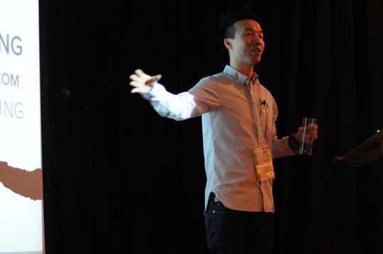
One speaker who engaged with the audience particularly well was Pak Hou Cheng.
I noticed that Pak decided to take up a more central position in front of the projector screen. I believe this helped him to deliver a more natural presentation style. His enthusiasm for the subject came across well.
Standing in front of the speaker stand where your laptop rests will help you engage with your audience better and people can focus on you as a presenter more quickly. An essential speakers tip!
Tip 4: Design for the Back Row
If you’ve ever sat at the back of the room, you might have noticed that it’s hard to see some of the information on the presentation slides.
Any information hidden below the front row of people’s heads is practically impossible to see without standing up or shifting to a better angle.
Normally, when I design presentation slides for speaking clients this is the number one thing I consider. Not everyone will be lucky enough to have a front-row seat vantage point.
Similar to thinking about placing content above the fold in web design, I recommend putting key points higher up the slides near the top right or top left of the screen. This way even the people in the very back row can see it.
Make sure you use clear typography that is easy to read also. Using a typeface with a 72 point or above should make the text readable at longer distances.
Tip 5: Think Billboards

When putting your presentation together, reflect on the advertising billboards you see on your travels.
Can you remember any that stood out? Did you notice anything about them in particular?
- Visual
- Bold use of typography
- Usually a simple statement or point
- Colourful & bright
The best slides are often powerful and visual statements. People see the slide and instantly get the point you are trying to make.
If you had an advertising billboard full of bullet points, how well do you think it would perform?
Tip 6: Prepare Well and Prepare Early
Early preparation prevents poor performance. Don’t leave your slides until the last minute – you’ll only end up running out of time and having a Death by PowerPoint classic on your hands.
I find it useful to start off with a pen and paper.
First, create a brainstorm of all the points, topics, and ideas you want to get across this will help you to construct your presentation more coherently and ensure that you deliver a content-rich presentation, hitting all the key points you wish to share with your audience.
Don’t be afraid to draw out ideas of what you want the slides to look like before you start creating them. I usually use Post-it notes for doing this.
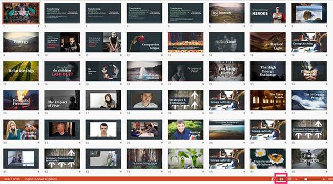
If you can find a blank wall, arrange the Post-it notes in the order you think the presentation should go. Shuffle them around until it’s perfect and then start creating your slides. You can also use the slide sorter view in PowerPoint or Keynote to arrange your slides in order and check the flow of the presentation is right.

I hope you found these speaker tips useful. And remember, if you want to avoid the stress, and hassle of creating your very own bespoke presentation deck, The Presentation Designer’s services are just one click away!
Good luck out there!
Check out the following write-ups about ThinkVisiblity:
Think Visibility 9 March 2013 – Conference Round Up by Anna Lewis
Think Visibility 9 Review (March 2013) – 5 Years Of Getting More From Your Website! – by Simon Barker of Zath
Photo Credit of Pak by Stephen Lilley – More Photos of ThinkVisibility 9 by Stephen.


7 thoughts on “ThinkVisibility: Speaker Tips & Advice”
Good tips Illiya, and I’ll certainly be looking to employ more of these as time goes on.
I still feel presenting is fairly new to me, I’ve not done a huge amount over the years, but I’ve tried to pay attention to a lot of peoples advice and try and take on board as much as possible.
For me, I think confidence is key – and that comes from experience I hope. I want to keep improving at speaking, and feel I’ve improved with each talk I’ve given – but I still have a lot to learn, and just need to take what positives I can, learn from the negatives and just try to keep improving.
Hey Pete. Thanks for the comment – much appreciated. Personally, I don’t think you need to worry too much about your presentation style. It reminded me a bit like Steve Jobs. Very simple delivery and effective. We can all improve sure – me include. I know confidence plays a major factor in delivering a good presentation. Yes, doing more talks regularly is the easiest way to get better.
Cheers Illiya for your kind words!
What I find is that if the “content” of the presentation is immense, the presentation from the speaker can almost be forgiven, which is nice I suppose…
Anyways awesome meeting you Illiya, and definitely catch you at the next event 🙂
My pleasure Pak – keep rocking that awesome ‘content’
Pingback: Think Visibility 9 Review (March 2013) - 5 Years Of Getting More From Your Website! | Zath
Pingback: Think Visibility 9 - Roundup of the March 2013 Event
Pingback: Think Visibility Roundup – TV9 – March 2013 | WebWeter.nl