Every computer comes with a set of fonts pre-installed as standard. What you probably didn’t know is that some of those fonts rock for presentations!
Here are five ‘classic‘ presentation fonts that we often use in our designs.
At The Presentation Designer, we use these fonts when custom fonts aren’t an option if multiple computers are sharing a PowerPoint template.
These are the five classic presentation fonts that will look good in any PowerPoint or Keynote presentation if you know how to use them correctly!
1. Helvetica
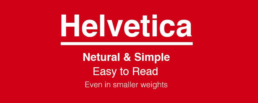
Quick, somebody, please alert the Helvetica police! You’ve probably heard it recommended time and time again, but Helvetica rocks this world.
It is a flexible, diverse and robust typeface.
The beauty of Helvetica is in its neutrality, a font that can blend to any style, like that of a chameleon in but in the font world.
If I could summarise Helvetica in one sentence, it would be: “Clarity with complete simplicity.”
The font Helvetica was designed and created by Max Miedinger & Eduard Hoffmann in the late 1950s.
Interestingly, Helvetica was originally named Die Neue Haas Grotesk (I’m sure that name went down well with the cool kids).
Helvetica has been extremely popular typeface with corporations.
America Apparel, for example, uses it for their logo. Here are 40 Excellent Logos that use Helvetica.
In presentations, Helvetica is powerful and can add real impact, but it doesn’t take over the limelight.
It is also effortless to read at different sizes and weights.
Some people may confuse Arial with Helvetica due to their number of similarities. To the non-typography connoisseur’s eye, it is hard to tell the difference between the two.
I found an excellent comparison of the two typefaces for you to compare.
I am also a big fan of Arial, but it didn’t quite make this top 5 list. (Plus, I would have frowned upon by a few of my designer buddies had I selected Arial above others on this list.)
2. Garamond
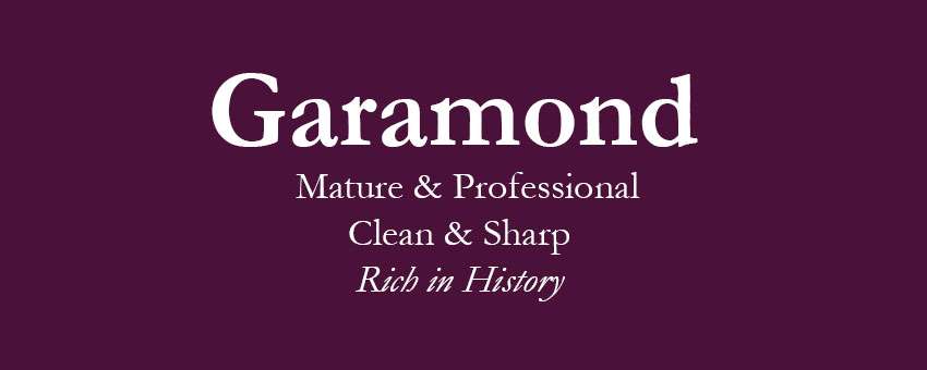
Not a typeface many would automatically go for but a great font all the same. I like Garamond for its more mature qualities.
It is a typeface that always remains professional with quite a clean, sharp appearance.
Garamond has a rich history behind it and one of the reasons I love it! Claude Garamond, a French publisher from Paris, created the font and was one of the leading type designers of his time.
The original typeface created for a French King called Francis I in the 1540s.
There have been many later versions of Garamond created, including numerous variations (trying to improve on the original version) such as a custom variant of the ITC Garamond typeface, called Apple Garamond.
3. Futura
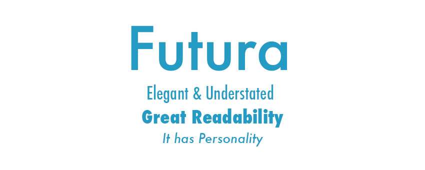
Futura is a Sans-serif typeface (meaning it has no serifs), designed between 1924 and 1926 by typeface designer Paul Renner and created during the Bauhaus period, commissioned by the Bauer type foundry.
A fun fact for you: the Apollo 11 astronauts left a commemorative plaque on the moon in 1969. The text set in Futura.
Futura is another font that is great for readability and one of the reasons it’s excellent in presentations, an elegant font that has a real personality.
There is an excellent article on Futura’s amazing past to see how the typeface has changed in design over the years.
4. Gill Sans
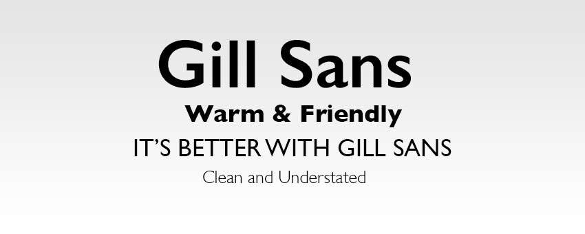
Gill Sans created by British graphic artist and sculptor Eric Gill, I’ve always had a soft spot for Gill Sans. It used to be my go-to font during my school years.
Another Sans Serif font, Gill Sans, presents a friendly and warm look without being too overstated. Some refer to Gill Sans as ‘the British Helvetica’.
Initially, it had been inspired by the typeface Johnston, by Edward Johnston. The Johnston typeface had previously been used for Transport for London on the London Underground in 1913. Eric Gill was once Johnston’s apprentice.
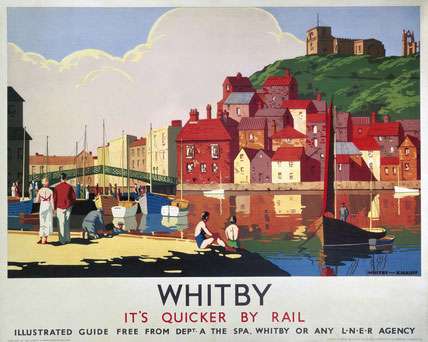
Gill Sans was popularised during its use as the typeface for all LNER’s (London and North Eastern Railway) posters and publicity material in the late 1920s.
The BBC logo still uses the typeface to this day, and it is still a popular modern font with many designers around the world. A true design classic.
5. Rockwell
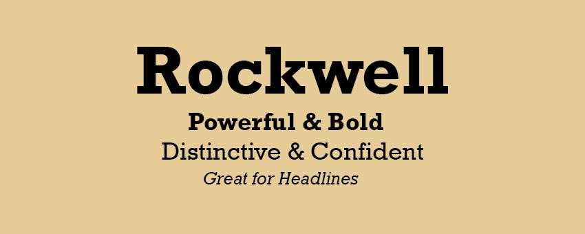
Last but not least, one of my most favourite fonts of all time is Rockwell.
The typeface was designed at Monotype foundry’s in-house design studio in 1934.
Rockwell is a font that is bold and vigorous, and it will give your presentation a distinct, confident look about it.
Rockwell primary use should be for display because of its mono-weighted stroke.
I’m a big fan of using Rockwell for significant points and headline text. It can add impact to your design if used right.
I’d suggest further reading this article exploring the use of Rockwell.
3 Tools to Help You Choose Better Presentation Fonts
In this video by Ran Segall, from Flux, he discusses and shows you how you can use the three font tools and websites listed below to help you choose better presentation fonts.
I’ve listed the three handy tools mention in the video here to help you choose more effective typefaces for your next presentation. I’ve used ‘Fonts in Use’ many times; it is a handy tool for choosing fonts for any design or project.
Bonus Font Tool
Here’s another handy font tool to help you choose better presentation fonts for your next project.
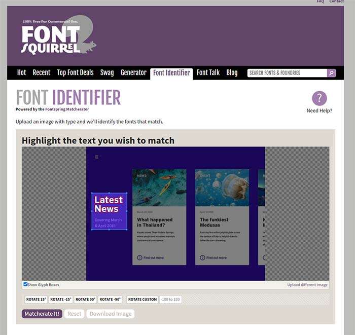
On the website Font Squirrel they have a “Matcherator” tool that will allow you to upload an image of a font you like and get a recommendation for the closest match for that typeface. It’s not perfect, but it does work reasonably well.
There you have it, five classic presentation fonts that every single person who has ever designed an Apple Keynote or Microsoft PowerPoint™ presentation should have in their arsenal. Please go out and enjoy them.


13 thoughts on “5 Classic Presentation Fonts”
My favourite font at the moment is Droid Serif. It’s a beautiful font for writing; readable and stylish. Great fact about Futura!
Nice artiicle 🙂 I like to use Calibri – a nice clear font.
Thanks for the comment Toby. I’ll have to return the favour. Calibri is nice. Standard Office 2011 + font these days I believe.
Great article, Futura looks like the one ill will use from now on, hopefully every person reads this so i dont need to see any Times New Roman or Garamond 🙂
I agree haha
No votes for Arial?
no Arial is boring never use it
Arial sucks too simple. Good for readability, but too drab. Futura rocks, as well as Rockwell.
Pretty nice collection. But don’t know why they are not coming as neat as its visible here on PowerPoint.
Thank you! It was interesting to read details about the fonts. But, Helvetica and Futura are missing in Office 2013. Are Calibri and Two Cen MT replacing the old fonts?
Pingback: Week 5 Communicating ideas – Muyu Li
Pingback: Pitch Decks: Which Type of Presentation Is Best for Your Startup? | DSH Startup Accelerator
Pingback: How to Create a Powerful Sales Presentation | Better Proposals Blog